Showing posts with label Website. Show all posts

Tuesday, February 12, 2008

A Web 2.0 Directory for Early Adopters

I just happened upon Go2Web20.net, a visual directory of over 2000 web 2.0 sites. Their About page claims it's a site for early adopters. I don't know if that's true, but I love being an early adopter -- it's so seldom that can say I am. But I like this site because it reminds me that there is SO MUCH out on the web that I never knew I was missing.


Simply scroll over a logo, and a little blurb about that site appears. No lag time, no clutter, no sales pitch. You can also search within a category via a tag cloud. My only wish would be to have a rating system in order to make some sort of judgment whether or not to click thru.

The simple design of the site makes it painfully obvious of the appeal or lack thereof of a logo design and name. I found myself scrolling over the cool looking logos or the logos that had a name with some reference to a topic I was interested in.

An unintentional benefit of go2web20.net is that a new web 2.0 company could use it as a quick and dirty brand appeal evaluation tool, by comparing their logo/name to their competitors in the same space. A survey using the resulting page would give a company some insight over their logo design/name strength, which could be useful for initial sales or adoption efforts.

For the record, I found this link via Jeremiah Owyang via a tweet on Twitter. Finding cool stuff that other people endorse is one of the reasons I love Twitter.

Tuesday, February 5, 2008

Twitter Google SuperTuesday Mashup Is Cool

I know it's a weak title for this post, but the Twitter / Google mashup map is cool, and I wanted to talk about it briefly as I am engaged with it. (map courtesy of TechCrunch)

As I sit on my couch watching coverage of the primaries on CNN, I'm also following the map on my laptop. People from all over the world are commenting -- from California to Maine, to Brazil and Spain.

I love the instant connection of commenting and talking to others on my twitter feed. But to actually see people's locations pop up every couple of seconds on the map makes the circle that I follow feel even more personal. It not just an avatar I can relate to, but a place, and that place no longer feels so distant or removed.

--

On a more business-y note, an article on Techcrunch talks about Google collaborating with Twitter on this mashup, despite purchasing a Twitter rival, Jaiku, last fall. I like that Google values the Twitter audience, and recognizes something special about us (our numbers? our locations? our influencer status? our early adopter behaviors?).

Does this mean Twitter will become more mainstream (if it isn't already)? I love the connections I make on Twitter -- the authors of the blog feeds I follow, and the people I talk to on Gooruze are on Twitter. I value their opinions, and like that I can find them all in one place. For professional development, its a huge influencer and guide.

Tuesday, January 22, 2008

Use Your Name Wisely, Have No (few) Regrets Later

How often do you leave a comment on another blog? A review site? A forum? Do you use your real name? Or something off the wall, like kittyclaws39, 123abc, or buhby (these just came to mind...for the record I do not use these names).

I use my name. But not Kathy Milette, the name most people know me by. I use Kathryn Milette. Why? I don't know...I just started and stuck to it. If you do a search for Kathy Milette, you'll most likely find out about my rowing career in college. If you search for Kathryn Milette, you'll find my social media involvement. If I really analyzed it (it doesn't take much effort), I use the name Kathryn Milette for professional reasons. I only post comments and thoughts that I won't (hopefully) regret anyone seeing, either now or 10 years from now.

I sometimes imagine the political impact if our current presidential hopefuls used social media outlets when they were kids. It's already relatively easy to find dirt on any one of them. But what if those hopefuls had had MySpace pages where they posted racy pictures of themselves from a frat party? (I wish this were the case for a certain Oregon mayor who shall not be named, but hers were posted intentionally and recently.)

Or if they posted some strong, questionable opinions to a political forum? Opinions that youth, idealism and naivete influenced, but came roaring back to bite them in the you know what 30 years later.

When choosing to use your real name in social media circles, you are essentially etching your opinions and thoughts in stone. Only this stone is indexed by search engines and is highly retrievable.

It may sound premature and doomsday-ish, but I think this is a good lesson to teach our kids in this online, engaged, interactive day and age. Not only is it safer for children not to post personal information online, but it's probably a wise career move, too. They won't care now, but they will probably (definitely) regret some of the things they made public when they were just being stupid kids.

Thursday, January 17, 2008

The Customer Journey Starts With Me

In my troubles with Kia (by the way, they got wind of my social media blitz, and gave me a call this week -- I'm encouraged, but more on this situation later) I've discovered something important about the customer journey.

The journey doesn't start at the door, to either a brick and mortar store or to a brand's landing page. It doesn't start with a company at all. It starts wherever the customer begins their own individual journey that minute, day, year. And this starting point matters. Let me tell you why.

I'll use my Kia experience as an example. When I have a problem with our van and have to bring it in, my experience does not start once I walk through the customer service door. It starts when I have to pack toys, snacks and juice bottles and extra changes of clothes and diapers -- necessities for time spent in a waiting room with two toddlers.

It continues when I have to bundle my children up and cart each one out to the van individually over sometimes icy sidewalks or snow. Barring any frozen door problems -- in which case I would have had to maneuver the children through the front doors and wiggle through to the back seat and buckle them in -- we all drive 20 minutes to the Kia dealership.

That's when the journey really starts. So if my Kia has multiple problems, and I have to experience this tedious journey often, it would be appropriate if the reception I get at the customer service door acknowledges and tries to mediate my troubles. After all, they've got my extensive service history at their fingertips.

You can translate this into an online experience as well. For instance, during the holidays, many people are using the web to shop from a variety of stores.

But if your website is hard to navigate, or your site has a tricky spelling and doesn't show up in search, or if it takes a long time to load, a user may be turned off to your brand. Not because any of these problematic qualities in particular, but because in comparison to the other sites they have been to, yours is not measuring up.

When I write stuff like this, I'm always looking for the takeaway. In this case, recognizing the starting point of the customer journey is important, because other brands, and other experiences, set expectations for your brand.

You may not be able to control these externalities, and you may not always be able to live up to such high standards. But you can do your best to make your destination in a user's journey as painless and as pleasurable as possible by paying attention to their activities and interactions with your brand (your store, your site, the experience you offer).

And being helpful (i.e. a site's ease of use, or a store's quick and successful product fix) and friendly (i.e. a site giving recommendations based on past preferences, or a store's acknowledgment and apology of excessive service visits) -- not either helpful or friendly -- goes a long way in a customer relationship.

Sunday, December 23, 2007

Top 5 Interactive Agency Websites

I've narrowed down the five most visually impressive interactive agency websites in the web design space. And the winner is...Schematic. But don't you want to know the rest? If you are interested in my analysis parameters and rationale, read on. If you just want to skip to the good stuff, scroll down.

As I mentioned in an earlier post, I've been visiting a lot of interactive agency corporate sites lately. I'm graduating next year from business school, and am considering working on the agency side, having already done the client side for several years.

So, I pulled AdAge's Top 50 interactive agency list* published earlier this year, and visited all the companies mentioned. All 50. It took a while.

Being the nerd that I am, I set up a spreadsheet, evaluating each website on service offerings and overall site impression. For one, I am interested in how each company talks about themselves (are they a digital agency, an interactive experience agency, an internet marketing agency, and what is the difference), and wanted to see trends in service offerings.

But every agency is so all over the board with their service mix (if they even talked about services), audience (healthcare, CPG, entertainment, retail, etc), and focus (being a partner vs a provider). AdAge also lumps a lot of services within interactive, including web design, web strategy, SEO, analytics, social media, technology, content management, etc. Most service titles and descriptions were a lesson in semantics, and I quickly realized it didn't make sense approaching my analysis in such a straightforward way.

I also wanted to see which agency I thought was the most visually impressive (sites that made me say "wow") looking from the perspective of a potential interactive design client. Please note I said design. This does not necessarily take into site navigation, architecture, copy, or content. I didn't read or look at every page on the site. I let the site take me on its own journey, and left when I felt the experience was complete.

So here we go...counting down to #1.

Top 5 Interactive Agency Websites

#5 DRAFTFCB (ranked #9 by AdAge)
At first, DRAFTFCB didn't make my list. I thought the home page was a little self indulgent (leading with their press, and graphics (though cool) relating to their office locations. It also seemed overly stark. It was when I clicked on "Who We Are" that I started to get excited. A video of someone writing in a journal describes the company. The music with the page is a little reminiscent of Beetlejuice, but eerily provacative.

#4 Arc Worldwide (ranked #25 by AdAge)
Arc Worldwide's site was unexpected, from the colors used to the geometric design pattern. A"ping" sounds when you click on different sections. Theirs is a very dynamic site -- a really nice use of scroll-over movement without being overkill. It's easy to read, sophisticated, and professional but not traditional.

#3 Rapp Collins Worldwide (ranked #5 by AdAge)
If you can be patient and let this site take its sweet time to load, the result is an incredibly innovative and impressive design. Rapp Collins' home page was initially super confusing, yet I knew I would love it if only I could figure it out. Which I eventually did (scroll up and down by putting your mouse at the top or bottom of the screen). This site is so gorgeous it should be illegal. I mean, they've designed cell phone flowers with hummingbirds flying in to drink out of them.

This site would have been my number one pick except for two deal breaking reasons. 1) Every page takes forever to load. That may be fine for design connoisseurs with terabytes of RAM and uber fast connection speeds, but my 512 RAM and 1.7GHz, DSL connection made it painful. 2) the "Creative Philosophy" page initially seemed very cool -- personalize the content for your audience. But it required me to fill out a form about myself to move forward, which, beyond the lifetime it took me to load the page, was too much of a time investment.

#2 Wirestone (ranked #43 by AdAge)
I was almost only going to look at the top 30 of AdAge's list, but I'm glad I looked at them all. #43 is #2 on this list because the site is not only visually beautiful (stellar quality and use of case study photography), but loads quickly, is easy to navigate, and above all, it's one of those sites where I feel that what I see is what I'd get from the company. Approachable but excellent. If I were a client or an employee of Wirestone, this site would make me proud to be associated with them.

#1 Schematic (ranked #28 by AdAge)
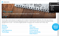
When I first came to this site, I (shamefully) admit I thought they were trying too hard to be different Aside from the requisite, gorgeous rotating image at the top, there are only large, bullet-point aqua color text links on the page.

But just click on a link, any link -- and don't blink. The page transitions are AMAZING! I don't know how else to express how impressed I was. If you haven't yet clicked on the link to Schematic, here's a visual. Imagine all the pages being printed out and then taped to a large wall in a grid-like pattern, and imagine looking through a video camera as you move from page to page -- up, down, sideways, and diagonally. The photography is also fantastic. So clean, so vivid.

I can't say enough about how much I enjoyed surfing Schematic's site. The visual gymnastics rival only Rapp Collins, but the site is so much more user friendly, it deserves to be #1.

Honorable Mentions
I can't help but mention some other sites that I enjoyed looking at. Resource's portfolio is a beautiful experience to browse through. AKQA leads off with a very well done (and in the case of Fiat, very fun) case study teaser. Brulant has a dynamic and interesting rotating graphic on their home page, and IconNicholson lets a visitor change the home page graphic to one of their own choosing.

It was not always only the visual that impressed me. I couldn't help but read and love Blast Radius' credo page. And Sapient had a very clean and professional site that nicely divided up their core competencies -- interactive and consulting.

Overall Impressions
I really enjoyed this research experience, and gained a lot of insight and perspective looking through these sites. One impression I had was that these agencies were forced to make a definitive positioning decision -- either appeal to a potential client's pragmatic business side, or wow them with design. Many chose to blend these goals and the result is a tame but professional experience. And most tried to weave in language recognizing design for business strategy results.

A second observation was that these agencies listed services like social media, mobile, and analytics alongside more traditional offerings like user experience design, branding/identity, and media planning/buying. I also I found that I really liked having case studies profiled or teased on the home page. And the final take away is that too many sites took too long to load, and often the wait wasn't worth it.

So what companies have I missed? Leave a comment with some of your favorites.

*AdAge determines rank by revenues, and notes % revenue change over previous year

Saturday, December 15, 2007

Page Titles: the Good, the Dull, and the Terrible

I recently read an article by Matt McGee about SEO and the importance of page titles. The topic is not really riveting, but as someone interested in learning more about search engine optimization, I thought the article was pretty informative and well written. I've never given much thought to page titles, but I started paying attention while researching interactive agencies for an upcoming blog article.

I have been sifting through dozens of interactive agency sites, searching for them first on Google so I could get a look at these page titles. Beyond evaluating the SEO qualities of them, I viewed them more from a brand standpoint, as the titles are the first clue into the company experience.

I was stunned how inconsistent some of these titles were with each other. I thought they would all be somewhat similar, and all outstanding. After all, while I expect interactive agencies to show superiority in design and user experience, I also expect sophisticated communication and word-smithing capabilities, and I didn't always see that.

The Good
To be fair, many of the page titles I saw were great, or at least pretty good. One I liked a lot was "Helps organizations define, build, measure, and expand their Internet strategy and presence." Informative, succinct, approachable, right? Here is another one I thought was pretty good -- "Specializing in the integration of technology, marketing and design." To the point, and easy to digest.

The Dull
Then there are the dull page titles. For instance, "Provides web development for large businesses," or, "A digital marketing company that specializes in collaborative web development solutions to enhance your business – and your visibility." These titles are fine, though a bit boring, and in the latter case, somewhat dirty (I wish they had left off everything after "solutions" -- it just sounds sales-y).

I'm also not a fan of page titles that have "award-winning" in them. Awards may be an account qualifier or winner later on, but I think that kind of phrasing is self-serving and better placed inside a site than espoused right off the bat.

The Terrible
Now onto the worst. You might think that the worst is a site without a title. Not so, though there are plenty of those. The worst is not even when the page title says "This site requires Macromedia Flash Player Version 7. Download Plugin."

No, the absolute worst page title I came across is "To view this site, you need the latest Flash plug-in. It's quick and easy to download, and well worth it!" Ugh. This leaves a bad taste in my mouth. I didn't even want to open the page. And when I did, I had to scroll up and down AND left and right. It was a very unsatisfying experience

Despite a crappy or lackluster page title, it was the content of the site that mattered, and many of the sites were great. I would say that page titles are an SEO priority for rank. As a brand communication element, a page title may influence a casual user browsing for an interactive agency, but I wouldn't expect that it would be earth shattering if a title doesn't measure up to the rest of the site experience.

Unless, of course, the title says "To view this site, you need the latest Flash plug-in. It's quick and easy to download, and well worth it!" That is just neglectful, and a turn-off. If you were to put a personal ad in the paper, you wouldn't say, "Must get a makeover before even thinking of contacting me. But you'll want to. Because I'm worth the trouble." It's just a little thing, really. But this little change could mean the difference between a site visit, an agency interview, a project, an account, a relationship.

Tags: ,